
Mövenpick
PACKAGING LIMITED EDITION & UI
Client: Mövenpick. Paris, France.
Role: Design leader for packaging line extensions and website graphic interface.
Skills: Conceptualization, design system, image beautification, graphic production, photography co-direction, presentation.
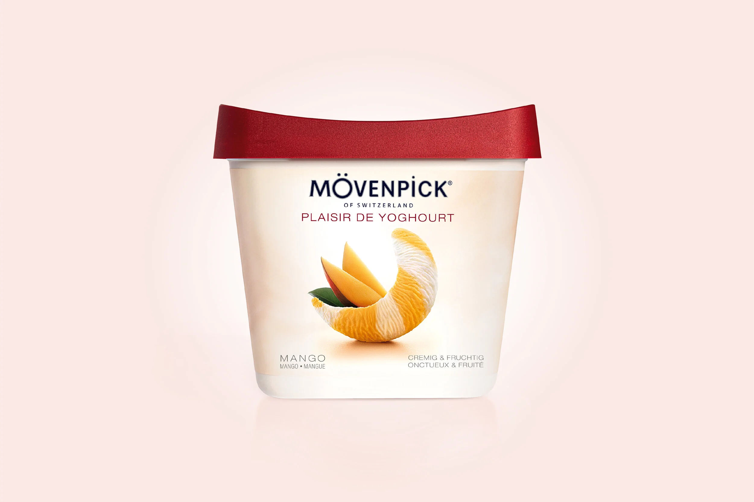
Mövenpick of Switzerland needed a packaging revamp for the Plaisir de Yoghourt collection, the given strategy placed the ice cream lovers desire for a light yet-flavorful experience at the heart of the brand promise. An online store graphic interface was also created.


Iconic ice cream
The packaging design features a tasty composition of ice cream topped with fruit; this visual metaphor became an important asset for Mövenpick. Plaisir de Yoghurt was launched in mango, and wild strawberry.


In branding, having a beautiful imagery is key, I like to call it visual poetry. The prototyped web app delivers a seductive graphic experience, full of engaging taste and visual sensations.

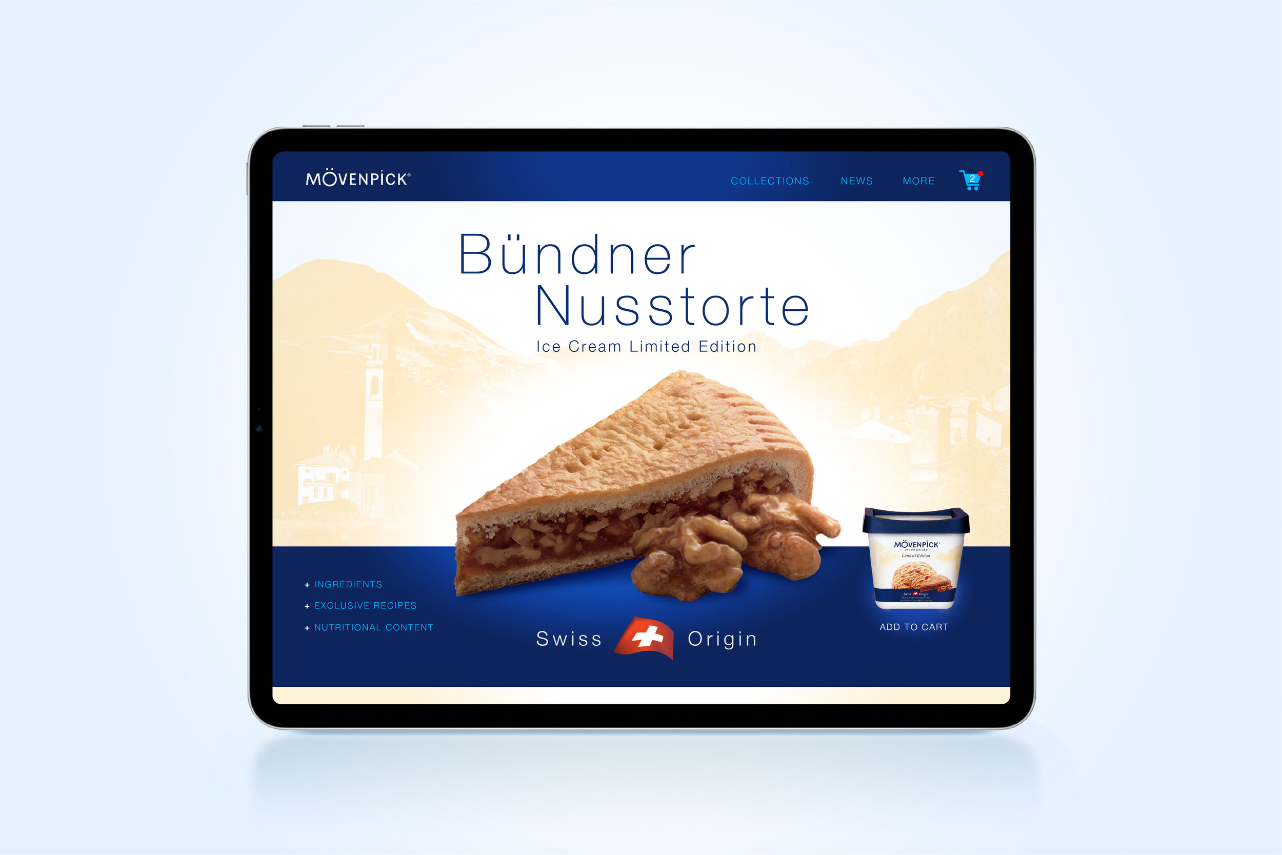
Swiss origins
The Swiss Origins ice cream edition celebrates food delicacies from Switzerland: The wonderful Double Crème de Gruyère et Meringues and the traditional Bündner Nusstorte.


I think that creating “delicious” artwork is only possible when outstanding photography meets design expertise.


Fine design is at the heart of Plaisir de Yoghourt and Swiss Origin editions. Powerful concepts, photography, and image beautification were skillfully applied to achieve this result.
